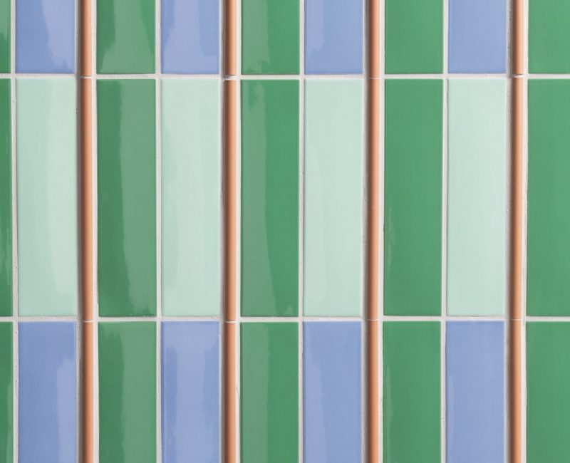
Kappa is pure colour, and it’s colour that turns the tables, offering countless combination possibilities.
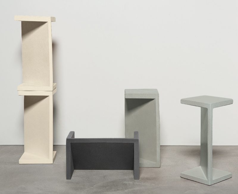
“Clay can be dirt in the wrong hands, but it can be art in the right one”
The Ape Grupo novelty born brilliantly in collaboration with Luigi Romanelli.
Opificio Ceramico’s on-the-road travels through three of Italy’s most iconic cities between tradition and innovation.
flamboyant and eclectic
4’ONE’Zero42
Bright colours, oversized formats and interconnected environments, 41Zero42 presents ONE, the innovative collection that excites!
As the noth-east wind, Mistral by Mutina introduces a breath of fresh air in ceramic and design world. Thanks to Barber & Osgerby Mutina’s research into three-dimensional elements led to a new artisanal partition product in tape casting terracotta. Discover it!
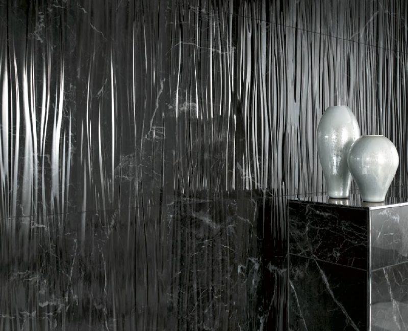
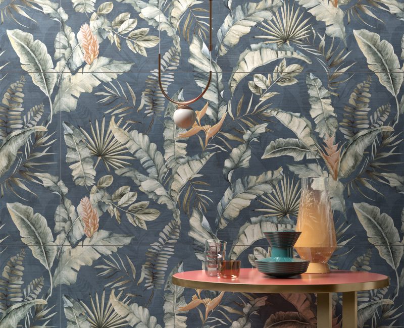
Marvel for a long time has given shape to our imagination, telling us fantastic stories and making them real. We’re not talking about the superheroes movies producer, though, but Atlas Concorde’s Marble Collection: take a look at the article!
Cedit has entrusted the creation of Cromatica to Formafantasma, two brilliant Italian molecules whose creativity has found breeding ground and incentives in the Netherlands. Cromatica is the absolutely successful attempt to explore colour and dominate it! Let’s discover it!
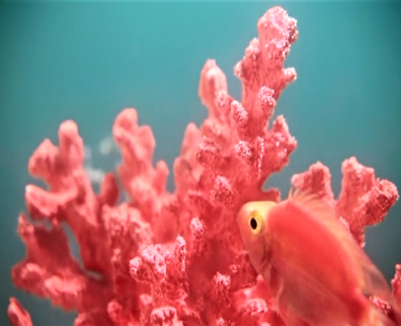
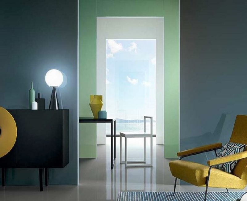
Pantone Color Institute chooses the Living Coral as color of 2019. A rich color. It has a sociable and lively essence that encourages us to do things in a light spirit. It symbolizes our innate need for optimism and the search for joy, it represents our desire for playfulness.
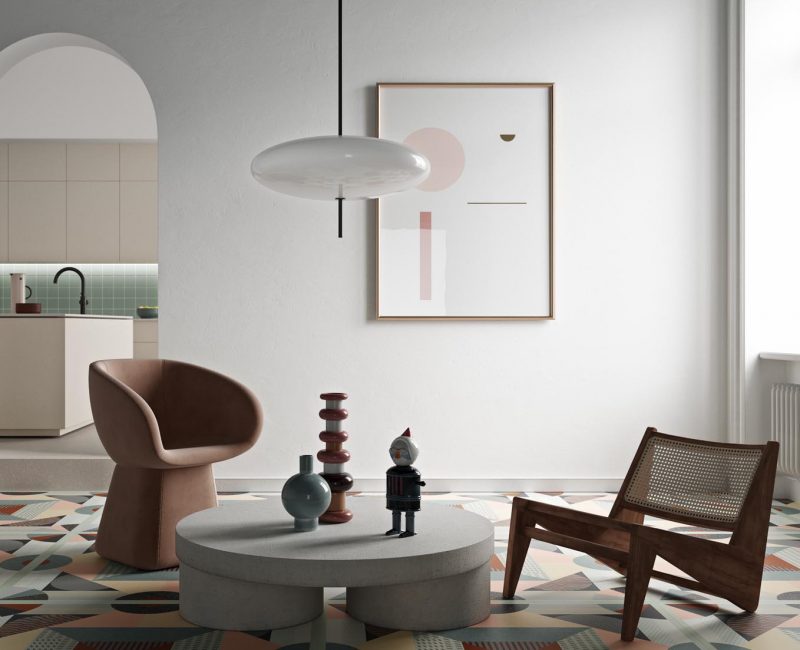
Neutra 6.0 open project. Walls become paintings where the color is the main element of expression with effective communicative properties, an emotional background that takes its shape from the individual’s freedom of imagination. Get it now with an extra discount on bhc-shoponline.it!