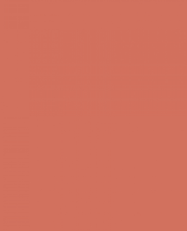
“Living Coral” (16-1546). It was 1963 when Pantone revolutionized the printing industry with the colorful PANTONE MATCHING SYSTEM®. A language of color is thus codified, creating an innovative tool that allows the selection, articulation and faithful reproduction of uniform and precise nuances in any part of the world; an essential support for players in different sectors: textiles, clothing, beauty, interior design, architecture and industrial design, which includes over 10,000 hue standards on multiple materials, including printing, fabrics, plastics, pigments and coatings. More than 10 million designers and manufacturers around the world rely on Pantone products and services to help define, communicate and control color from inspiration to realization, using Pantone standards available both digitally and physically.
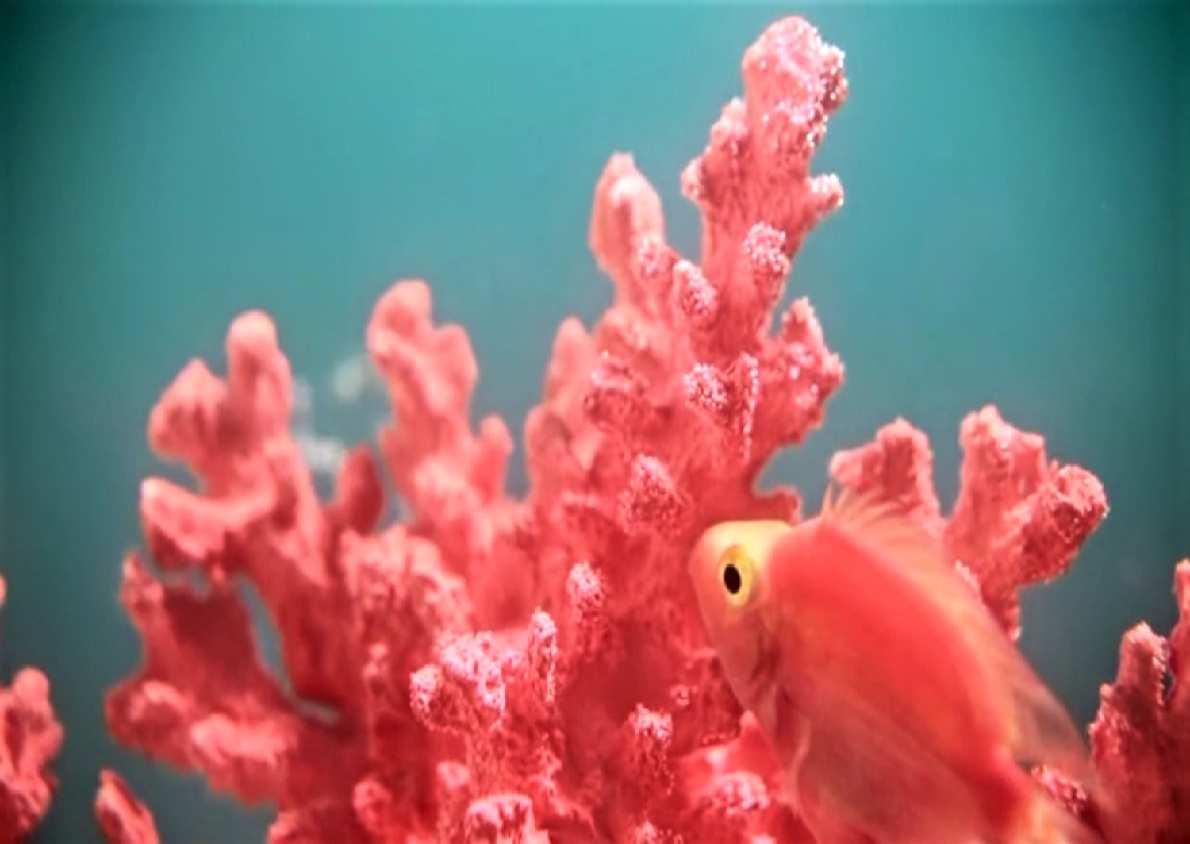
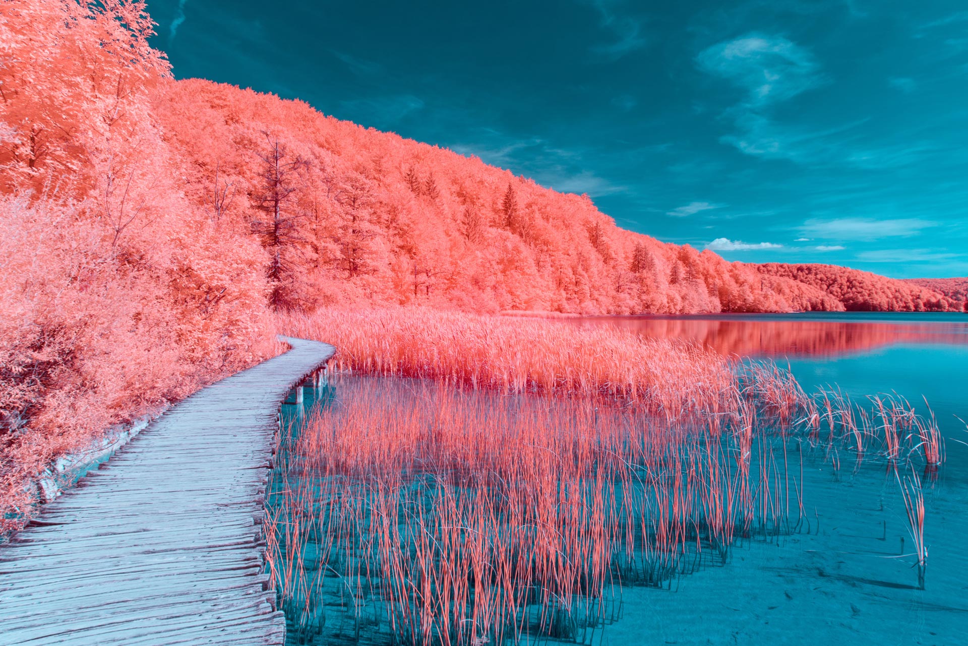
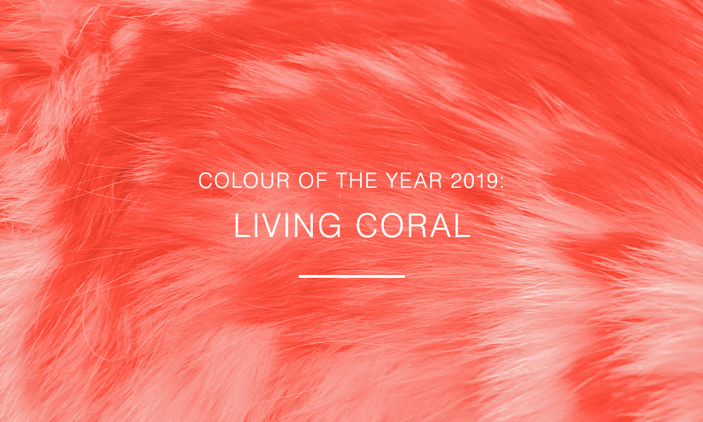
Pantone Color Institute, which therefore offers a universal color language, is such a color consultancy authority that its trend forecasts, including Pantone Color of the Year, Color Trend Reports, Color Psychology, can dictate the trend of an entire season. Which is the color that Pantone has chosen for 2019, is now by public domain “Living Coral” (16-1546). It will influence fashion, art and design a lot: get ready to see it everywhere on Instagram and in the shop windows. In the announcement of the choice, Pantone experts explained that Living Coral (alive, bright coral) «represents the fusion of modern life» and that it is a «rich color, continuously around us in the real world and together with a lively presence on the social media ». “It has a sociable and lively essence,” they add, “and encourages us to do things in a light spirit. It symbolizes our innate need for optimism and the search for joy, it represents our desire for playfulness ».
Some forerunners already introduced tones close to the Living Coral in their ranges. Let’s see, among the surfaces, where to research.
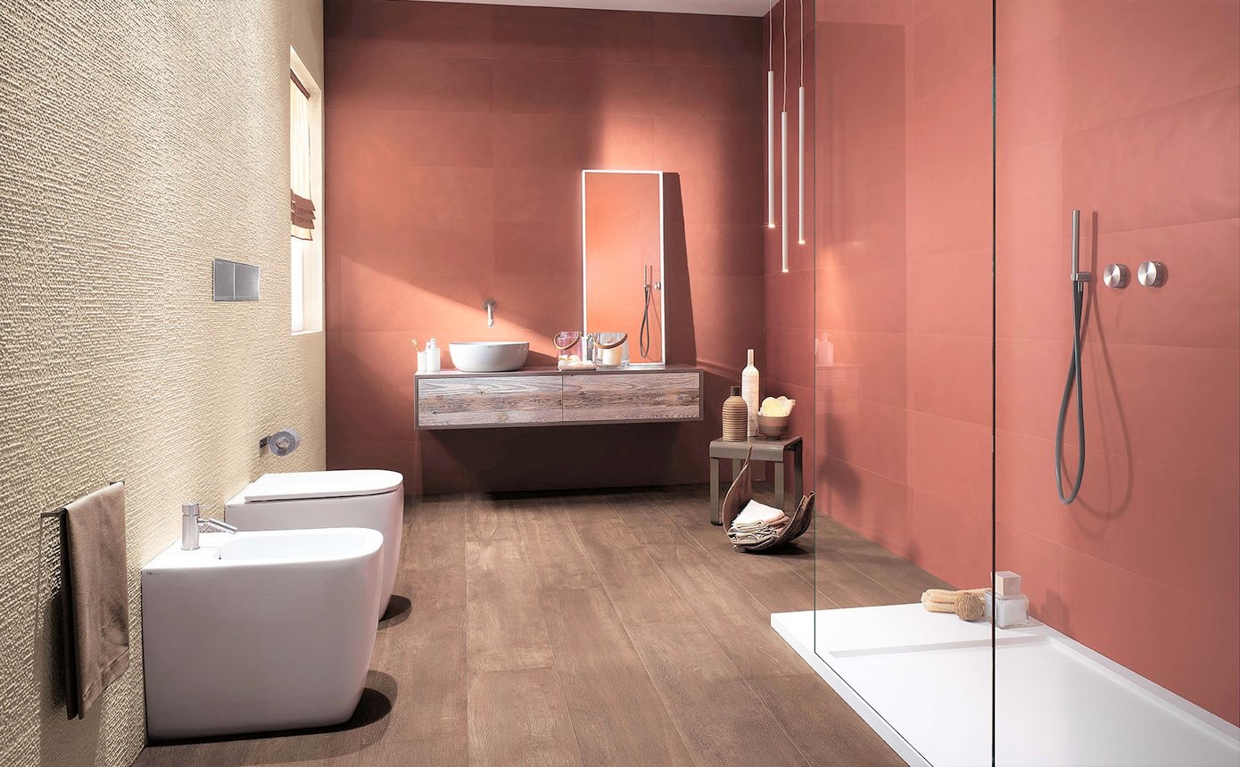
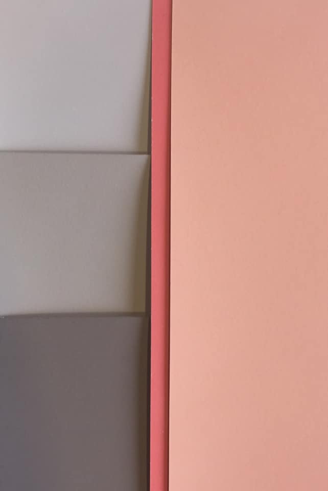
Neutra 6.0, protagonist of the ceramic scene for a long time (Neutra 6.0: a new color release), proposes 13.Corallo, which is more saturated than the other fashionable. But it is softened by the delicate and relaxed surface. Suitable only for covering and available in slabs up to 240 cm, with a thickness of only 6 mm, it is an evergreen of Casa Dolce Casa and it is combined with stuccos and paintings in the same shade. Fine porcelain stoneware becomes a real design element that converts walls into huge paintings, a vehicle of expression with effective communicative properties and an emotional background that takes shape from the individual’s freedom of imagination.
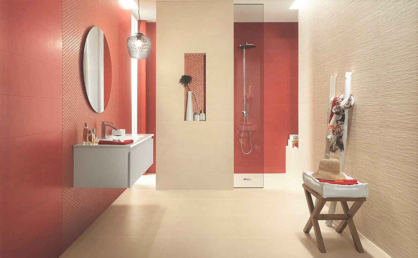
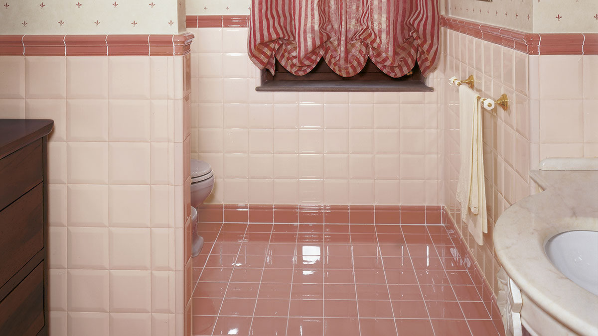
Load of similar color, but in 30.5×91 format, for the more recent Colornow by Fap Ceramiche, to whom we dedicated an article short time ago. A new project of modern bathroom cladding with extraordinary expressive power and ability to excite, the result of technological know-how and the soul of trendsetter that have always distinguished the brand. This line of white-body coverings is articulated in 8 intense colors including Marsala for a glamorous and trendy color palette, able to perfectly meet the most modern aesthetic requirements. Color Now expresses all its energy through the material, giving the surrounding environment spectacular chromatic and luminous games, for a direct and immediate, irresistible tactile and visual experience.
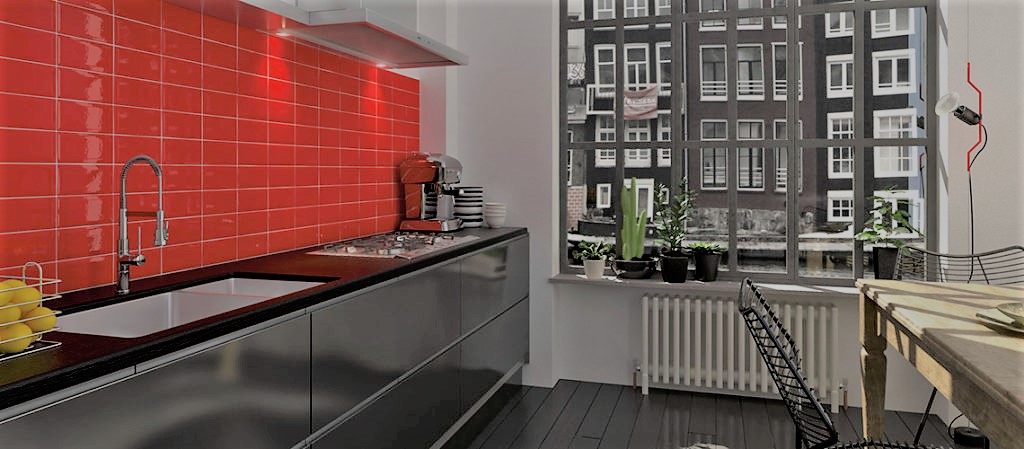
Surely Coral by Vogue, that lives in Trasparenze collection is more sanguineous. The tone is uniform but clear and the diamond version gives brightness and dynamism. The brand property of Altaeco is a must for the color of the surfaces, always modern and purposeful.
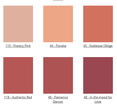
Last but not least, a proper space should be reserved for those who made the backbone of color: The Paint Makers Company & Co. The production method is fundamental for Colorificio Centrale Spa, in the productive heart of Brescia. 120 colors are created individually, in 110-liter vats, where raw materials are added in a careful way and with passion to obtain a product of excellence, and they are the result of an ever-increasing aesthetic and qualitative research. The richness of minerals and the unique blend make the tones vibrant, alive, and offer on one hand a technical solution to contemporary living needs, while on the other hand the stylistic answer for all those who – like us – are not satisfied by a good result, but they are always looking for refinement of details. An experience in paints sector started in 1946 together with the dream of creating a line of products without compromising on quality, has given life to a brand that proposes itself as a new point of reference for excellence in color. Within their personal pantone, in which each brushstroke tells a story, we see which colors wink at Living Coral.
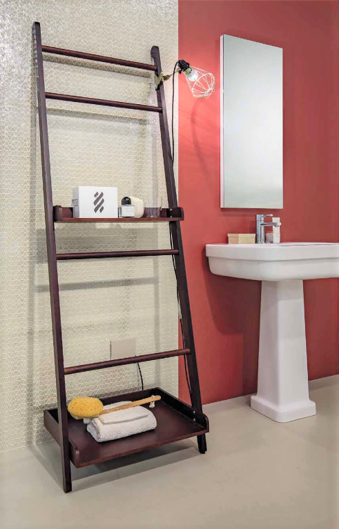
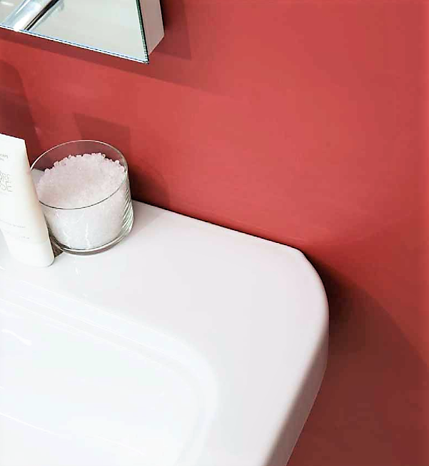
Federica Capelli, at the top of the artistic direction and marketing of Paint Makers, declared long time ago “Because of its extremely bold nature, it would seem difficult to integrate it into an interior design project. Do you think you can live without it? Resign yourself to it, sooner or later you will see it appearing in your projects even if only on accessories and furnishings… so, better get prepared “. She continued “… being a strong and vivid color, it can be included into a project as accent, not so much as a dominant color: to be tested on a section of the wall. For a more refined combination try it in association with warm neutral shades like beige, sand or brown. If you like the idea of introducing a touch of Coral but do not want to exaggerate, consider placing it on some objects or furnishing accessories, keeping a neutral palette as base. You will obtain a fresh and à la page look, but also easily renewable once coral will end up in oblivion … It is a bright, warm color and therefore suitable for rooms that receive little natural light as they are able to give them the possibility to live again.” But where do we have to look for it, in the Paint Makers range? The shades that best represent Living Coral and its inspiration are certainly N. 44 FLORALIA and N. 45 NOBLESSE OBLIGE, as N. 46 Authentic Red, N. 46 Flamenco Dancer and N. 115 Pottery Pink.
All that remains is to let ourselves be intrigued by this trend, therefore, and open the doors of our homes to it. But beware, let’s learn to make good use of fashions and not to be exploited by them. Introducing it gradually and always respecting our personality and attitudes! We are waiting for you in our Show room in Via Maestri Campionesi 20 in Milan, where we can choose together the most suitable color.

